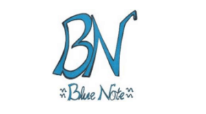
Blue Note vs. Blue Note: The word and figurative mark was able to assert protection before the BPatG against the earlier word mark despite the identical word element Blue Note. Even since some identical goods were claimed, the BPatG regarded the graphic design as distinctive against the earlier word mark.
A word and figurative mark, like other types of mark, must have distinctive character as a company sign and must not be descriptive of the goods and services for which trade mark protection is sought (see case Alpine Welten (CJEU)). That, however, was not the point at issue in the present case.
Rather, an appeal against the trademark registration of the German word and figurative mark Blue Note was filed before the BPatG with reference to the earlier registered word mark Blue Note (EM 010 597 251). The opponent claimed that there was a likelihood of confusion with its own earlier word mark Blue Note, particularly since some identical goods were claimed.
Earlier mark in a new sign: Indication of likelihood of confusion
According to general case law, the incorporation of an earlier mark into a younger sign is considered a strong indication of similarity and likelihood of confusion, possibly even a bad faith trade mark application (please compare SHOWROOM vs. SHOWROOM 86). Only a few weeks ago the European Court (CFI) ruled also in this sense in the OOfos case. In this judgment, the CFI stated that the word elements of a word and figurative mark are in principle more distinctive than their figurative elements, since consumers like to refer to goods which they can cite.
The BPatG also held that view. Since the word element of a mark is most likely to be perceived by the public as a sign, the word element in a word and figurative mark must be given special attention, the BPatG also emphasised. However, this only applies to the examination of the likelihood of phonetic confusion, because a visual design does not address the acoustic but only the visual perception, the Federal Patent Court stated. Since, however, the dispute mark has a particularly striking graphic design, the court found that the design of the mark also had an influence on the phonetical perception of the dispute mark.
Phonetically difference despite the same word element
The BPatG stated that the public would perceive the letters ‘BN’ as co-shaping within the overall sign of the challenged mark because of the graphic emphasis by size and font design. The letters “BN” in particular had a significant, if not predominant, influence on the overall impression of the later mark. At most, if the public were to recognise the words “Blue Note” in the challenged mark at all, it would understand them as a whole “BN Blue Note”. Therefore, according to court the two marks are phonetically different despite the same word element: the public would pronounce ‘be en blu not’ for the mark in dispute and ‘blu not’ for the earlier word mark.
In a comparable EcoBlue/Blue case, the CFI had already ruled in November 2008 (T:2008:489, confirmed by ECJ, Case C-23/09 P) that the protection afforded by the registration of a word mark applies to the word indicated in the application and not to the graphic or stylistic features that that mark might have. EcoBlue had argued that the mark was partially written in capital letters. This was considered irrelevant before the CFI. EcoBlue lost against the earlier word mark Blue.
A case recently decided by the EuG confirms this: DUNGEONS & DRAGONS versus DUNGEONS
In its judgment, the BPatG referred directly to the EcoBlue/Blue case. In the EcoBlue case, EcoBlue had been registered as a Union word mark, i.e. the two word marks EcoBlue and Blue were compared. However, in the present case, Blue Note, the comparison is between the word and figurative marks and the word mark. The BPatG held that there was a clear visual difference between the marks to be compared.
Overall impression based on the earlier word mark?
A likelihood of confusion could also be affirmed if the overall impression of the challenged mark consisting of several components is influenced by the component which is identical to the opposing mark, the court conceded. This presupposes, however, that the remaining components of the mark are largely secondary and do not influence the overall impression of the sign. However, that is not the case with the word and figurative mark Blue Note, the BPatG stated. The shorter the word element, the greater the importance of the graphic design and the visual differences, the BPatG added.
Please read in this context our article: MAN versus MANDO – likelihood of confusion?
Distinctive through eye-catching design
The graphic design of the challenged mark prevented the assumption of likelihood of confusion between the two marks Blue Note, the Court ruled.
The BPatG explained that, overall, the signs differed clearly in phonetic, visual and conceptual terms due to the striking graphic and the two capital letters of the challenged mark. The challenged mark is characterised phonetically by its word parts “BN” and “Blue Note”. In view of the striking graphic appearance of the capital letters “BN”, which precede it in large letters, it cannot be assumed that those two letters are not pronounced, the Court of First Instance stated.
Nor can there be any direct conceptual likelihood of confusion, since ‘Blue Note’ is not a common combination of words in the English language, according to the German court. The Court pointed out that there were several meanings of the word ‘blue note’ and referred, inter alia, to “coloured slips of paper” or “blue banknote”, or even as a general “suggestion of a blue hue” or “reference to a blues melody”.
The BPatG held that there was no likelihood of confusion between the comparison marks in relation to the goods covered by the challenged mark under § 9(1)(2) and 125b(1) of the German Markengesetz and dismissed the appeal brought by the proprietor of the word mark “Blue Note”.
Would you also like to protect your trademark or your brand name?
Our lawyers will be pleased to advise you. If you are interested, please contact us – we look forward to hearing from you!

Sources:
Judgement of German BPatG “Blue Note” 27 W (pat) 108/16
Image:


Leave a Reply